Map #1

Source:http://www.wjla.com/
http://www.wjla.com/blogs/weather/2011/12/odds-of-a-white-christmas-for-d-c-increase-slightly--14050.html
This map shows the probability of any given area in the United States having a "White Christmas." For this map, a White Christmas is defined as a location receiving at least one inch of snowfall on December 25th. What I found interesting about this particular map are some of the inconsistencies found within the more general pattern of increased probability of snowfall the farther north in the United States an area is. A fact demonstrating these inconsistencies is that there is a higher probability of snowfall in the Midwestern regions of Idaho and Wyoming, than a large area of Montana, a state to the north of Wyoming. This begs the question of why this significant area in Montana has a lower probability of a White Christmas compared to other states at similar latitudes like North Dakota and Michigan.
Map #2
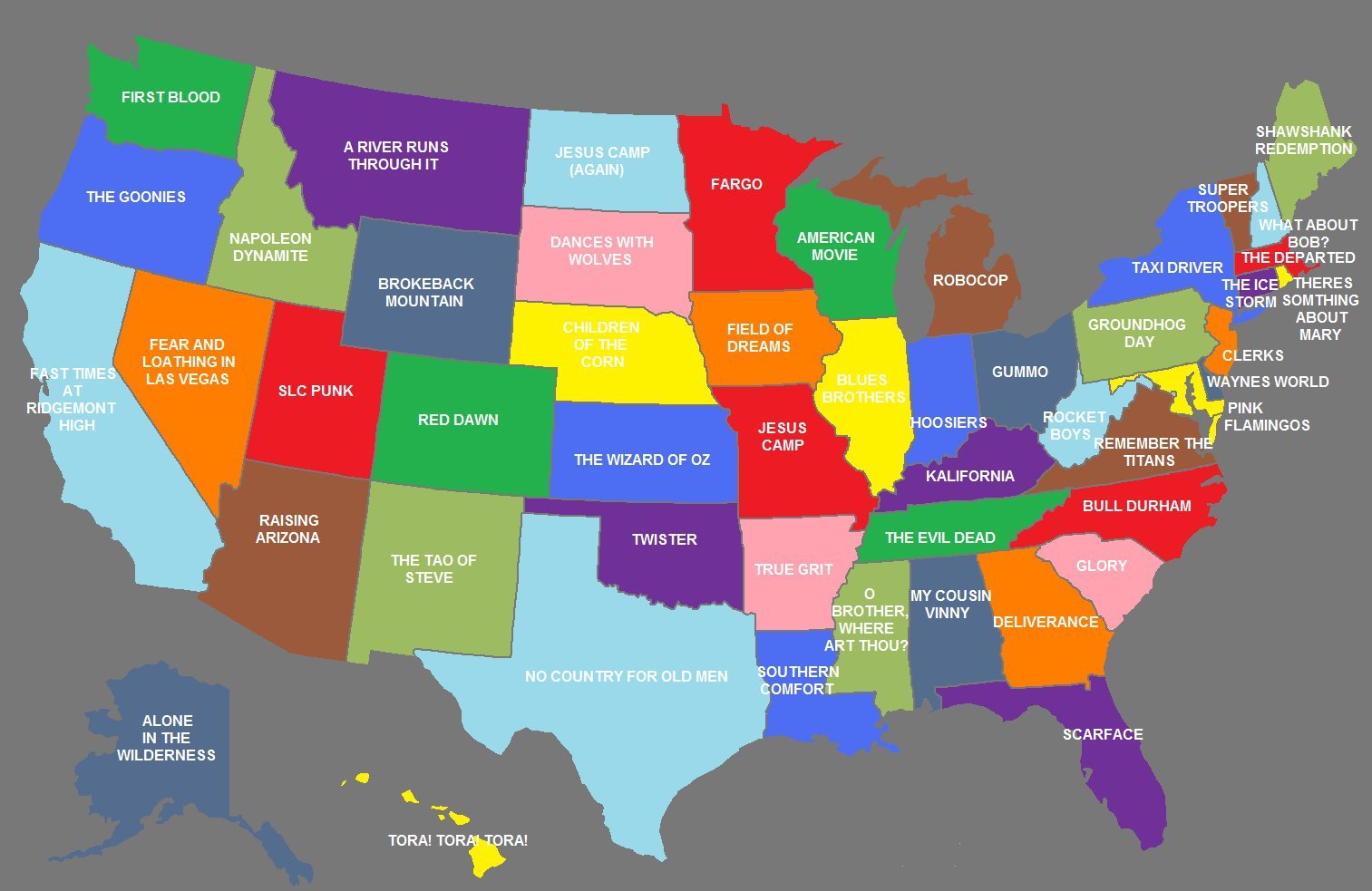
Source: http://drhiphop85.com/
http://drhiphop85.com/2011/06/02/u-s-stereotype-maps-movies-tv-shame-and-awesomeness/
This map labels each of the 50 states in accordance with a relatively famous film that took place in that particular state. Although a map like this is subject to the preferences and biases of the map's creator, a wide variety of film genres are represented here, including comedy (There's Something About Mary), horror (The Evil Dead), and family films (The Goonies). This map is interesting to me due to some of the plot patterns to be found in films of certain parts of the United States. For example, many of the films chosen for the Midwest revolve around a plot driven in some part by the rural agricultural landscape. Whether this plot revolves around evil farmer children (Children of the Corn in Nebraska) or tornadoes (Twister in Oklahoma and The Wizard of Oz in Kansas), they are brought about in some way by the flattened wide open spaces of the Midwest. Furthermore, many of the films located in the Northeastern New England states have a general similarity in that their plots revolve around troubled people doing awful things to one another just because they can, as shown in the cheating spouses of The Ice Storm, the mafia hits in The Departed, and Bill Murray being rude just for the sake of it in Groundhog Day).
Map #3
Source: http://watchdog.org/category/kansas/
http://watchdog.org/36805/ks-kansas-among-highest-in-education-jobs-per-k-12-student/
This map shows K-12 employment of educators per state for the year 2007. The map gives the percentage of education employees per 100 students, the placement of that state relative to the other 50 based on that percentage, and color codes each state depending on which quartile the given stats place that state in. What is interesting about this map is the fact that the western United States consistently falls in the bottom quartile while the states up in the northeast place into the top quartile. This begs the question of why one side of the United States succeeds in hiring out a greater number of educators per student and the other lags behind significantly. Furthermore, are the students in the states with higher percentages of teachers per student receiving a lesser education in accordance with the figures given in this map. However, when one takes a closer look at the numbers given for each state, one can see that Washington, which placed last is only approximately ten percentage points behind Wyoming, which placed first. This observation supports further research into whether the minimal point differences between the states have a significant effect on the overall education of the students.
No comments:
Post a Comment